

We remember a simpler time when we’d design an awesome website, test it in a couple web browsers and launch it on the interwebs. The website looked consistent on every 17-21” desktop monitor, and we high-fived. It was pretty easy.
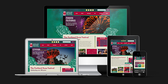
In January 2007 those simple times went up in a puff of smoke when Steve Jobs held up the first iPhone for all the world to see. Fast forward to today when devices, browsers and operating systems exist in seemingly infinite combinations. On the Fish Marketing website, over 400 unique screen resolutions and 200 different devices visited us this past year. That’s a whole lotta pixels to account for!
The exploding mobile market has created challenges for many businesses. First of all, that website that looked great on that desktop monitor probably looks like a scrunched up mess on your phone. People are pinch-zooming and accidental-link-clicking your website only to give up on slow loading pages. The fact is, you need a solution. But which solution is right for you?
There are really two solutions to catapult your website to mobile glory and relieve visitor frustration. We’ve outlined the benefits and pitfalls below, in hopes that you can make the best decision to suit your business.
Mobile Responsive Website:
- Responsive means that your website adapts to different screen sizes. Instead of just focusing on desktop and mobile, a responsive site changes at many “breakpoints” like phone, tablet, laptop, computer and projector.
- Responsive takes a “mobile first” development approach. The most important content to a phone user appears on small screens and more features are added when screen real estate grows.
- Google recommends responsive web design as the best mobile solution. Google also predicts that 50% of web searches will be from mobile devices by December, 2014. Responsive web design is the perfect way to capitalize on this emerging web traffic.
- It usually makes sense to develop a responsive site from the ground up, but that doesn’t mean your existing site can’t be retrofitted. Depending on how your site is built, a skilled developer can enhance your current website with CSS code to make it responsive.
- A responsive site runs from the same content and back end, no matter what shape and size it displays. Changes and additions are a breeze since there is no double updating.
- The cost of a responsive website is generally higher, but the return on investment is being future ready. The website is built to respond, so new devices and screens are covered before they are invented.
Separate Mobile Website:
- Separate mobile sites can be appealing since they usually come with a low price tag. In fact, there are automated services out there that can convert your website to a separate mobile version for very low cost in a tiny amount of time.
- Some businesses need only show a mobile visitor a couple items, like a phone number and price. A tow truck service or a chimney sweep are perfect examples. For businesses like these, a separate mobile site is a perfect solution for the lowest cost.
- The main pitfall of this solution is that your website and mobile site are separate entities. This has major disadvantages like double updating whenever you have any sort of change.
- A separate mobile site may fail to address the “space between” visitors surfing on tablets, large smart phones and small laptops. What will they see?
- A separate mobile website can also confuse search engines. With two versions of the same page, Google can accidentally show your mobile search result to a desktop user and vice versa. If you are considering a separate mobile website, be sure it is technically annotated for search crawlers.
- To keep up with changing technology, a mobile site might need to be rebuilt more frequently. While the cost is low today, think about the future when considering your return on investment.