
The Pettibon System offers rehabilitation products like adjusting tools, rehab equipment and chairs that can offer permanent solutions to those suffering from back pain.
As a well-established, trusted brand, Pettibon wanted to update their logo to better align (get it? Align? Because of spines and…nevermind) with who they are as a company and their years of experience. They felt that their old logo was busy, hard to transpose, and nobody knew what it meant. They wanted a simple logo that conveyed mobility and communicated a feeling of healing and recovery.
Art Director Bob Smith approached the new logo in the same way he always does—by engaging the client as a collaborator, making them a real contributor to the process.
“I try to demystify the creation process,” Smith says. “There’s already so much intentional obfuscation and mystery that surrounds design, so I believe if I can clearly explain the process, it’ll be much easier to justify design solutions that might be outside their comfort zone.”.
In his initial presentation, Smith first went over where they started, to make sure he had a good grasp of where they were coming from.
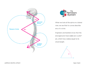
Fig. 1: Where we began.
In Pettibon’s case, their previous logo was based on the lateral view of a spine, and the various 60-degree angles involved. That was his starting point.
From there, after research on the company and their market, he came up with various directions, some of which made it into the first draft of the logo, some of which didn’t.
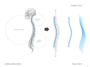
Fig. 2: Solution Path 3 – The Evolution
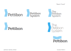
Fig. 3: Solution Path 5 – “Beach Towel.”
In Figure 3, we see the first of a few logos in the first draft presentation.
It’s very seldom that the first drafts of a logo hit the bullseye, but they always help to bring the target further into focus. This case was no exception. The client loved the usage of the shape of the spine but wasn’t sure how to articulate how the current designs weren’t hitting the mark. This often happens with clients, because they’re experts in what they do, not in design lingo. So they did something a little unorthodox—they sent drawings of some design directions of their own.
Smith then had to do one of the hardest jobs a designer has—utilzing client and peer feedback to inform a new direction without losing his initial vision. He took in all their thoughts and images and found a through line between their ideas and his own.
What he came up with was a single logo idea to present as a second draft.
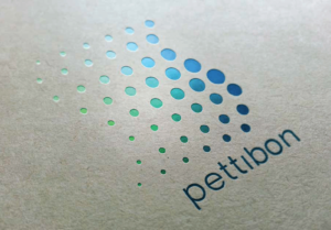
The final logo utilized blue to convey calm and green to convey balance and the restorative nature of Pettibon’s products and services. The pattern above the company name symbolizes the freedom of movement clients can hope to attain utlizing their products.
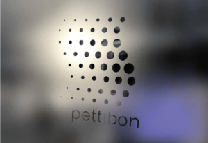
“It’s important to present the designs ‘in-situ,’ so the client can see how the identity system works in context,” Smith says.
So he created examples of how the logo might look in real practical applications.
The client loved it.
Once they chose the final direction, it was up to Smith to create the Style Guidelines—what he calls “the care and feeding of the new identity system.” These help ensure that any future designers understand what they can and can’t do with the logo, wordmark, and pattern. (Reverse on black? Sure! Stretch or squish to fit? For the love of heck, no!)
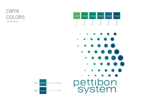
“The important thing to educate the client about is that this isn’t a stand-alone logo—it’s an identity system, with the logo being part of that system. The System is the entire look and feel — the logo should be the kiss at the end,” Smith says.
How do you feel about your logo? If you think it’s getting a little well-worn, consider an update! Just like with people, you’d be amazed at how invigorating it can feel for a company to get a new look.